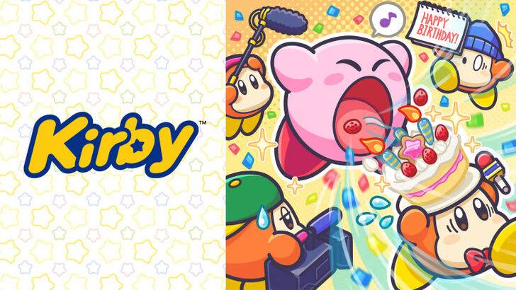
Exploring the Evolution of Kirby's Image: From "Angry Kirby" to Global Consistency
This article delves into the fascinating story behind the differing portrayals of Kirby in Western and Japanese markets, drawing on insights from former Nintendo employees. The discussion centers on the strategic decisions behind the marketing and localization of this beloved pink puffball.

The "Angry Kirby" Phenomenon:
The Western depiction of Kirby often features a more determined, even "angry," expression on game covers and promotional materials. This contrast with the typically sweeter Japanese portrayal sparked the fan-coined term "Angry Kirby." Former Nintendo Localization Director, Leslie Swan, clarified that the intent wasn't to portray anger, but rather a sense of resolute determination, a characteristic deemed more appealing to the Western tween and teen boy demographic. Shinya Kumazaki, director of Kirby: Triple Deluxe, echoed this sentiment, highlighting the differing preferences between Japanese and US audiences. While cute Kirby resonated strongly in Japan, a tougher, battle-hardened Kirby proved more effective in the West. However, he noted that this wasn't a universal rule, citing Kirby Super Star Ultra's consistent box art across regions.
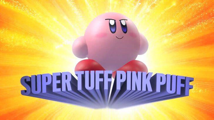
Marketing Strategies and the "Super Tuff Pink Puff":
Nintendo's marketing strategies aimed to broaden Kirby's appeal, particularly among boys. The memorable "Super Tuff Pink Puff" tagline for Kirby Super Star Ultra exemplifies this effort. Former Nintendo of America Public Relations Manager, Krysta Yang, explained the company's desire to shed its "kiddie" image during a specific period. The perception of a game as "kiddie" was considered detrimental to sales. This led to a conscious effort to highlight Kirby's combat abilities and downplay the character's inherent cuteness, attempting to appeal to a more mature audience. Although recent years have seen a more balanced approach, focusing on gameplay and abilities rather than personality, the perception of Kirby as "cute" still predominates.
Regional Variations in Localization:
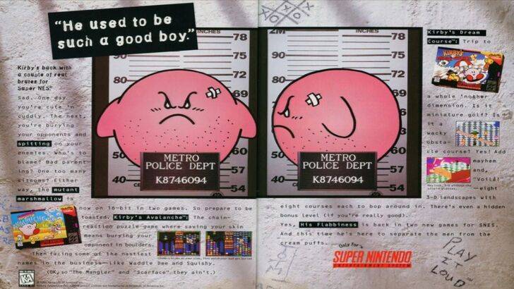
The differences between Japanese and US localization began early. A 1995 "Play It Loud" advertisement featuring Kirby in a mugshot is a prime example. Subsequent years saw variations in Kirby's facial expressions on game box art, with titles like Kirby: Nightmare in Dream Land, Kirby Air Ride, and Kirby: Squeak Squad showcasing a more serious Kirby. Even Kirby's color was altered; the original Kirby's Dreamland for Game Boy featured a ghostly-white Kirby in the US, a decision attributed to the Game Boy's monochrome display. This early decision, coupled with the perceived need to appeal to a broader audience, led to the consistent adoption of a "tougher" Kirby image in Western artwork. However, in recent years, a more consistent global approach has emerged, with Kirby's image alternating between serious and cheerful expressions.
A Shift Towards Global Consistency:
Both Swan and Yang agree that Nintendo's approach has become increasingly globalized. Closer collaboration between Nintendo of America and the Japan office has resulted in more consistent marketing and localization strategies. The company is actively moving away from regional variations like those seen in Kirby's box art, aiming for a unified brand image. While this ensures consistency, Yang acknowledges potential drawbacks, suggesting that a focus on global appeal might lead to less distinctive, risk-averse marketing. However, the increasing familiarity of Western audiences with Japanese culture might also be a factor in this shift.
 Latest Downloads
 Downlaod


 Top News